 COVID Tracking Project
  Writing
  Publication
  Tableau
 The problem
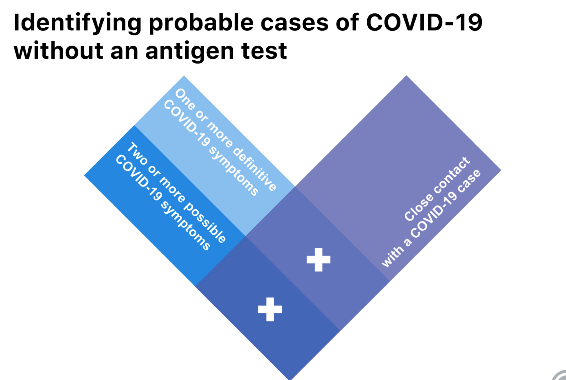
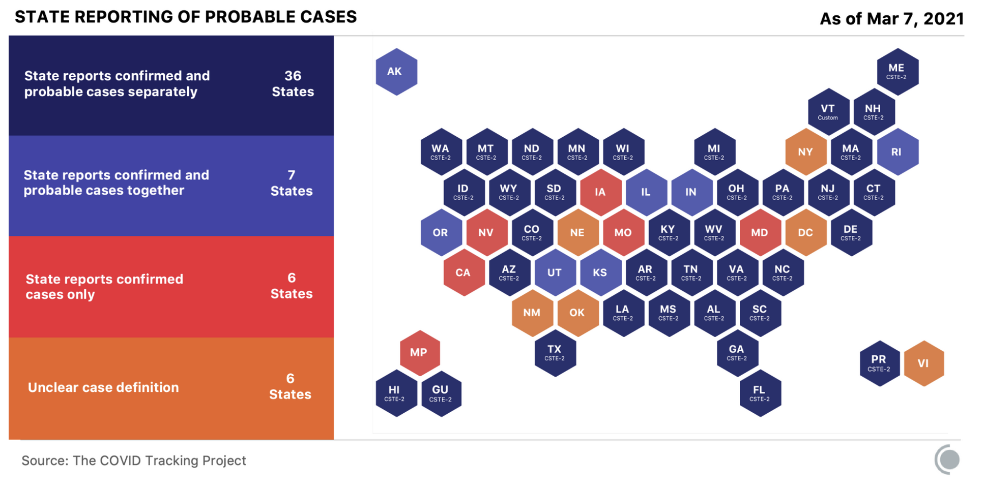
As the data team at the Atlantic’s COVID Tracking Project trudged through the daily routines of gathering, cleaning, validating and storing case data from across all 50 states + US territories, we became the pattern-detecting antenna for the pandemic in the US. One thing we noticed: There was a problem with “Probable Cases”. Actually a few problems. While every state reported confirmed COVID-19 cases, far fewer tracked probable cases, and on top of that, they didn’t all use the same definition of probable case. For most of 2020, there was no official definition so not only did the definition of “probable” vary by state, for many states, it changed over time. Looking only at confirmed counts left a meaningful chunk of the pandemic invisible. Accurate data is important for understanding a pandemic. But this complexity around the definition of probably cases was also leading to a dangerous (and false) narrative: That hospitals were deliberately over-reporting COVID-19 case and death counts and attributing deaths to COVID-19 that were actually due to other causes.
What We built
A piece in The COVID Tracking Project’s analysis series, co-authored with Madhavi Bharadwaj and Kara W. Schechtman, making the case to lay-audiences and journalists that confirmed-case counts alone were only part of the pandemic picture. The piece traces how each state’s definition of “probable” shifted across 2020 and 2021, and why the resulting gap in coverage mattered.
A supporting Tableau viz, Which States Are Reporting Probables, visualizes the state-by-state reporting picture that the article references.
What it shows
- The crucial role science-reporting plays in making complex public health concepts accessible
- The importance of nationally-standardized definitions for effective pandemic monitoring across individual states
- Data visualization strategies for complex story telling
- How you can run an amazingly effective organization on Slack
Stack
Co-authored writing · Tableau · COVID Tracking Project